> ## Documentation Index
> Fetch the complete documentation index at: https://docs.depost.ai/llms.txt
> Use this file to discover all available pages before exploring further.
# Analytics
> Followers, engagement, posting cadence, and which posts actually worked.
Analytics covers your LinkedIn performance — what's growing, what isn't, and which posts
carried it.
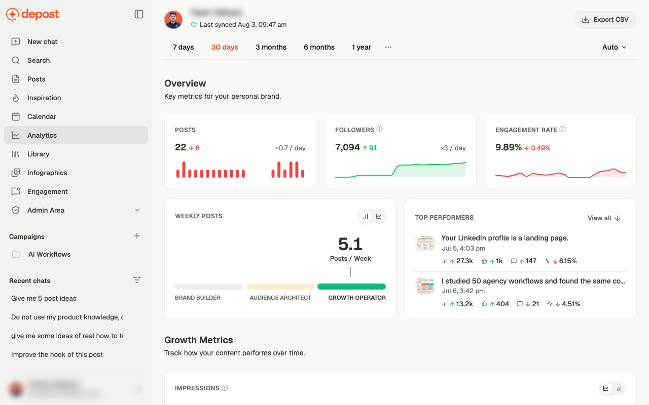 The header shows when data was **last synced**. Numbers reflect that moment, not this one,
so a post published minutes ago won't appear yet.
## Choosing a period
**7 days · 30 days · 3 months · 6 months · 1 year**, with more behind the **…** menu.
**Auto** controls how points are grouped in the charts.
Shorter periods are noisier. A single strong post moves a 7-day engagement rate a long way,
which is why a bad week and a good week can both be misleading. For judging direction, use
3 months.
## The headline numbers
| Metric | What to read from it |
| ------------------- | ------------------------------------------- |
| **Posts** | How much you published, with a per-day rate |
| **Followers** | Total and the change over the period |
| **Engagement rate** | Interactions relative to reach |
Each shows a delta against the previous period, and a sparkline for the shape. The shape
matters more than the number — steady beats spiky.
## Posting cadence
**Weekly Posts** shows your average, placed on a band:
Lower cadence. Presence rather than volume.
A middle rhythm — consistent without dominating anyone's feed.
High cadence, aimed at reach.
The band is a description, not a target. Moving up it only helps if the extra posts are as
good as the ones you already publish — cadence multiplies quality in both directions.
## Top performers
Your strongest posts for the period, each with impressions, reactions, comments, and
engagement rate. **View all** opens the full list.
This is the most directly useful panel on the screen, because it tells you what to do more
of. Take it into chat and ask *why* those worked — see
[analyze your content](/chat/analyze).
## Growth metrics
Charts for impressions and related measures over the period, so you can see trend rather
than a single figure.
## Exporting
**Export CSV** takes the data out for a report or a client update.
Judge direction over three months, not seven days. A single strong post moves a weekly
engagement rate far enough to make a good week and a bad one both misleading.
## Related
Ask chat what these numbers mean and what to do about them.
Benchmark yourself against what works elsewhere.
The posts behind the numbers.
Where cadence is actually set.
The header shows when data was **last synced**. Numbers reflect that moment, not this one,
so a post published minutes ago won't appear yet.
## Choosing a period
**7 days · 30 days · 3 months · 6 months · 1 year**, with more behind the **…** menu.
**Auto** controls how points are grouped in the charts.
Shorter periods are noisier. A single strong post moves a 7-day engagement rate a long way,
which is why a bad week and a good week can both be misleading. For judging direction, use
3 months.
## The headline numbers
| Metric | What to read from it |
| ------------------- | ------------------------------------------- |
| **Posts** | How much you published, with a per-day rate |
| **Followers** | Total and the change over the period |
| **Engagement rate** | Interactions relative to reach |
Each shows a delta against the previous period, and a sparkline for the shape. The shape
matters more than the number — steady beats spiky.
## Posting cadence
**Weekly Posts** shows your average, placed on a band:
Lower cadence. Presence rather than volume.
A middle rhythm — consistent without dominating anyone's feed.
High cadence, aimed at reach.
The band is a description, not a target. Moving up it only helps if the extra posts are as
good as the ones you already publish — cadence multiplies quality in both directions.
## Top performers
Your strongest posts for the period, each with impressions, reactions, comments, and
engagement rate. **View all** opens the full list.
This is the most directly useful panel on the screen, because it tells you what to do more
of. Take it into chat and ask *why* those worked — see
[analyze your content](/chat/analyze).
## Growth metrics
Charts for impressions and related measures over the period, so you can see trend rather
than a single figure.
## Exporting
**Export CSV** takes the data out for a report or a client update.
Judge direction over three months, not seven days. A single strong post moves a weekly
engagement rate far enough to make a good week and a bad one both misleading.
## Related
Ask chat what these numbers mean and what to do about them.
Benchmark yourself against what works elsewhere.
The posts behind the numbers.
Where cadence is actually set.